We’ve put a lot of work into our space and team over the last few years to establish, our voice, our purpose and our culture.
As part of our consolidation strategy we decided to embark on the challenge of capturing our culture and values in a distinct visual language, so that even our International clients who aren’t able to set foot in our sacred space, or meet our team face to face, are able to get an immediate sense of who we are and what we stand for. To do this we teamed up with Sheldon Stewart of Hale Design to relook our logo and branding and how it can roll out across platforms.
In this article Sheldon will talk us through his conceptual thinking and process that led to where we are now and what you see.
The Pressure Cooker Studio’s (PCS) visual identity started with conceptual exploration, and after presenting three different design routes, we decided that the PCS monogram needed to stay. It is a mark loved by the PCS team and clients but has never been used to its full potential.
Now, Hale had to solve the evolution of the monogram. We started by recreating the shapes and their proportions. Next, we added horizontal strokes to each half-circle, making the P and C unmistakable. By reconstructing the monogram, it became perfectly symmetrical and square. This balance defined the design system’s development. Our typography choices complemented the boldness and visual weight of the monogram. The final logo is flowing and rhythmical but confident and proud.
Once we had a final logo, we used the monogram and its square proportions as a launchpad for the visual language.
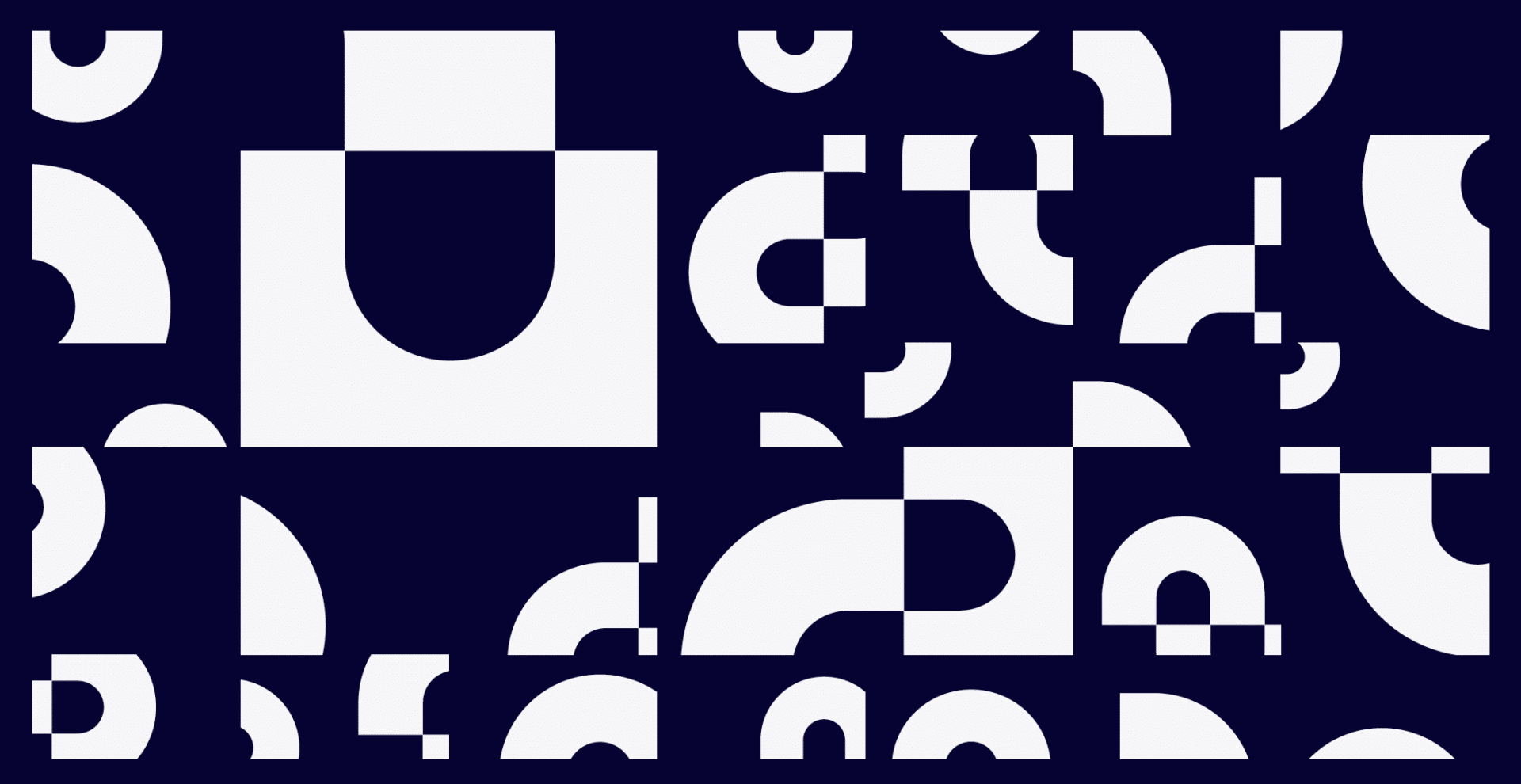
An underlying grid system (made up of squares) gives the brand its structure.
A key consideration during the design process was creating a feeling of music, flow, and rhythm. The grid allowed each layout to achieve this with generous negative space, and together with the black and white colour palette, it resembled a music score.
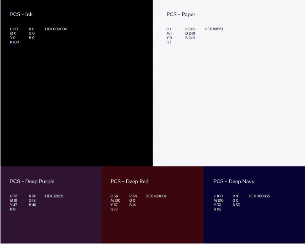
The selected colour palette brings across this idea of sheet music. The white is just off-white, closer to a piece of music paper.
The black has a dose of blue, resembling pen ink used to write music
scores. The black and white colour combination is subtle, but it adds just that little bit of difference.
The secondary palette of deep purple, deep navy, and deep red adds elegance.
The visual language includes graphic patterns and shape elements designed using the monogram. Each pattern piece is placed within a block on the grid. This container gives each element a place to play, flow and create. A beautiful conceptual link to the process of PCS, a studio that provides structure to pure creativity. A safe place for musicians to express themselves freely.
The patterns are a wonderfully rhythmical expression of the monogram. The graphic shapes were created by deconstructing the logo into its key forms. These shapes are used as flourishes for the finishing touches to a considered layout.
The brand is slick, structured, and professional. Bringing all the elements together results in a brand that looks like music. Designing this brand was an absolute privilege, and I hope it inspires everyone at PCS. I can’t wait to see where PCS goes next.
Sheldon Stewart
Hale